Clarity & Simplicity: 17 Vital Steps to Create a Calm, Easy Website Navigation

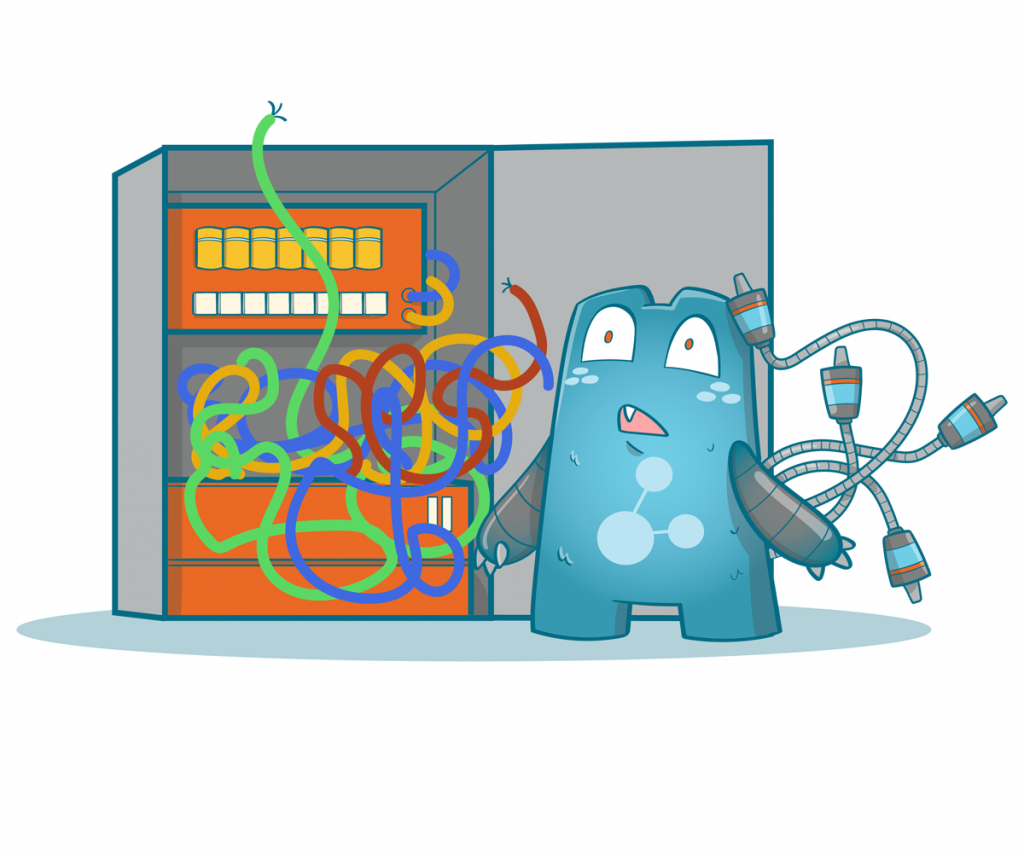
Achieving easy website navigation is among the hardest parts of creating a website. Plus, the ease of navigating a website says a lot about how organized its site structure is. If a web visitor has a hard time locating your web pages, most probably, your site’s structure is disorganized or the site itself lacks special elements.
So, how do you keep your site’s navigation simple but useful? In this article, we share some of the most common practices to ensure organized navigation for your site. Plus, we’ve added some elements that you can include in your pages that will help in making your site’s navigation simpler.
How Does Website Navigation Work?
Websites are composed of different pages, each with its own web address. These individual pages are connected through hyperlinks to other relevant web pages in order to ease navigation when moving throughout a website.
This ease-of-use is essential for both visitors and search engines alike, which use it as a way to determine what content should appear on their results page or not. Search engines base on how well a specific webpage matches up against certain keywords searched by users.
If your site isn’t easy enough to navigate, then you risk losing traffic from either side. Whether users get lost within your site without locating the information they need (which will lead them away), or whether search engine bots don’t see your page worthy of ranking high in SERPs because of its ease of use.
Easy website navigation is important in your overall site design plan because it can significantly impact user experience and search engine rankings. Both are essential when trying to grow your business online.
- Content Hierarchies and Site Navigation
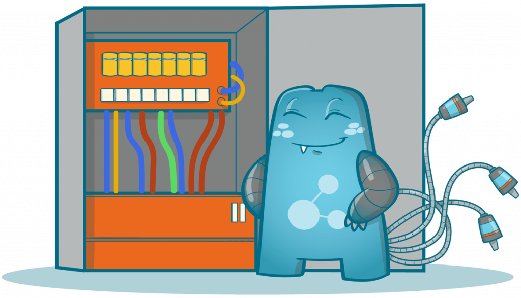
Most, if not all, websites have hierarchies. Some have levels that go deeper, while others have just one to three levels. The hierarchy that you use for a website depends on the purpose of the site, its design, resources, etc. There isn’t one type of website hierarchy that’s best for all sites.
Content hierarchies are established so that users and search engines can quickly scour through all of your content and find what they are looking for. If you have a site with lots of content, this can help ease the confusion.
There are basically two ways to layout your website hierarchies: by using breadcrumbs or through drop-down menus found on most sites today. Drop-down menus seem to be more popular than breadcrumb trails at the moment. However, both methods serve pretty much the same purpose and ease navigation in similar ways.
- Drop Down Menu
When it comes to ease of use for users and search engines alike, there’s nothing better than having clear-cut lists that lead visitors right where they need to go within your site hierarchy without them needing to spend time searching around on their own accord. Drop-down menus are a great way to do this.
Simple site navigation is always best, and that’s exactly what drop-down menus offer. Visitors can find the information they need by simply clicking on an option from a list of options rather than having to scroll through several pages in order to get where they want or need to go within your site hierarchy.
Not only does a drop-down menu help create easy website navigation, but it also makes for easy searching, among other things too!
- Breadcrumbs
While breadcrumbs aren’t as popular today as drop-down menu systems, you still see them used here and there across many sites, including eCommerce stores like Amazon. But why? What purpose do breadcrumb trails serve if not everyone uses them anymore?
When it comes to ease of use, breadcrumb trails are just as good as drop-down menus. In fact, some people even think they’re better!
Breadcrumbs have been around for a long time now, and many webmasters swear by them because they can be used in an infinite number of ways compared to being limited with options like you would find within a drop-down menu system (although there is still the option to customize your own item if needed).
Even though breadcrumb trails aren’t nearly as popular today as they used to be, many people prefer using them over other types of site navigation systems. This is because users don’t need any training on using such systems or where each link will take them.
Since they’re simple and easy to use, breadcrumbs are also used to create easy website navigation while still allowing users the freedom of customization. Just because it’s old-fashioned doesn’t mean we should stop using them entirely.
Easy Website Navigation: Does it Matter?
When web visitors arrive at a particular website, they will expect to navigate a website with ease and have a great user experience. However, a large number of websites on the internet aren’t designed that way.
As a site owner, it is your responsibility to give your visitors both ease in navigation and a great user experience. Because if they get both, the chance of converting them will be higher. It is also possible that they will become one of your loyal readers or customers.
So, to help you out in making your site’s navigation simpler, here are some of the practices you need to include in your strategy:
- Planning Your Navigation System
With every project in any industry, the first step would be to carefully lay out a plan on how to execute a particular project. This is the same with a site’s navigation system. For your system, you would need to think about what elements would be good for your navigation system and where to place them. You also need to know the hierarchy in which your content should be displayed.
You can’t just simply toss in different posts and product pages together, you’d need to create an organized site structure so that your web visitors will easily find the information they need.
For example, say you have three category pages: fishes, birds, and mammals. The right thing to do is to place posts about the different types of birds and how to care for them under the category page ‘birds.’ Right?
But what if, upon clicking the ‘birds’ category page, a visitor finds content about dogs, cats, and elephants? Wouldn’t that confuse your visitors?—of course it would. So to make the navigation of your site easier, you would need to think about where to fit these pages into your site structure.
A site structure usually looks like a diagram that starts with the home page and down to the bottom-level pages of your site. Keep in mind that when you’re planning, you don’t have to be ‘right’ since there isn’t actually a right way to create a site map. It just needs to make your visitor’s experience better.
Internal Link Juicer allows you to provide users with easier navigation since relevant pages on your website are connected by the plugin. This means users can easily access the valuable pages on your website through the internal links you’ve set up. This leads to more traffic and engagement.

- Use a User-Friendly Language
The language you use for the navigation links on your site is also crucial in making your site’s navigation system simpler. Being creative and specific with your labels is a good idea; however, if you overdo it some of your web visitors, especially the beginners or newbies in your industry, might not easily understand what you’re talking about.
For example, if your site is in an industry-specific niche like internal links and SEO, you should not use terms like ‘link equity’ or ‘PageRank’ since beginners wouldn’t immediately understand them. If a beginner isn’t familiar with what these terms mean, it is possible that they would search for the term on a search engine and they would be led to another website.
This means that they might not go back to your site and look for a site that is easier to understand. So, as a rule of thumb, if it takes more than a second to understand what a link means, you should try to make the words much simpler.
Remember, you shouldn’t trade clarity just to sound too professional and look creative.
- Use What Has Been Tried and Tested
Using tried and tested techniques should be your go-to, especially if you’re a beginner in creating your navigation system. Conventional ways in creating a simpler navigational system have been proven to make a site’s navigation easier.
However, there are exceptions to this rule. If you know that you have a better idea to make your navigation system much simpler then do it.
- Make Your Primary Navigation Stand Out
Your primary navigation should immediately stand out when a web visitor arrives on your website. Typically, main menus are located at the top part of a web page or at either the right part or left part of the page.
If you’re still confused, main menus are usually designed to stand out. It will usually have a color that contrasts everything around it. Plus, main menus contain all the links to the most important pages on your website (category pages, contact page, blog, etc.).
When your primary navigation stands out, visitors won’t have a hard time locating the most important pages on your website. They could just simply click the link they want to explore and discover the pages in that category.
Aside from improving the user experience of your guests, your on-site time and bounce rate metrics will also improve.
- Use the Logo as a Link
Using your logo as a link back to your homepage is common. However, not all sites maximize it. In most cases, the logo is placed at the top left part of most sites and when clicked, links to the home page.
Doing so will allow web visitors to get back to the home page in case they want to investigate your site further. This is among the conventions that you need to follow since it has been proven to make your site easier to navigate.
- Create a Responsive Navigation
A responsive website attracts more visitors since they find them great to look at on any device. In most websites out there, a ‘hamburger menu’ is incorporated into the home page. This ‘hamburger menu’ is a compact navigation menu that is made up of three horizontal lines which is why it has been likened to a hamburger.
Even if you don’t work in the digital space, there’s a high chance that you are familiar with the hamburger menu and how it works even if you don’t know what its specific name is.
Hamburger menus are effective in helping people who use their mobile phones in navigating a website without taking too much space. The function of a hamburger menu varies from site to site. In some, it slides down or to the side when clicked or in others, it pops up when the mouse is hovered over it. However it works, the purpose is still the same—ease the navigation for web users.
Even if hamburger menus are widely used, not all websites employ them. Websites with a lot of content usually don’t have this type of menu, but boutique websites like eCommerce sites have them.
When designing a hamburger menu, you need to remember that your visitors don’t get confused when navigating the site. In desktop sites, hamburger menus aren’t really an issue, but for mobile phones, navigation can sometimes be confusing. So be sure that your hamburger menu will be mobile-friendly.
- Maximize the Use of Footers
Normally, footers are reserved for links to privacy policies, website terms, terms & conditions, etc. However, you can also use it to display email forms, address details, and social links. This way, you can link your visitors to other important pages on your site or other websites like social media platforms where you have a page for your company.
- Incorporate a Fixed Navigation
Fixed navigation is basically a menu that doesn’t disappear even if a web user scrolls up or down your page. A sticky menu isn’t for all websites so if you’re planning on placing one, you need to examine your site if it is suitable for its design and navigation purposes.
- Use Breadcrumbs
A breadcrumb is like a trail that shows a visitor where he is currently located on the website. Breadcrumbs are usually located below the menu page and it follows you as you scroll down the web page. This way, even if a visitor is midway through the content, he/she can immediately go back to a previous page he was in with just one click.
- Keep Your Website Consistent
One of the crucial steps is to keep your website consistent. Your users should be able to navigate quickly and easily, no matter which page they’re on. If you have a drop-down menu for main categories that’s the same as your secondary navigation bar, it will simplify things if people can use either one without having to figure out where each link points.
- Don’t Overload Your Web Pages
If ease of usage is essential in the functionality of your website, ease of navigation is just as crucial in the design. You want something visually appealing and easy to look at while not distracting from the content on the page.
If you have a ton of buttons or links all over your site pointing off to different pages, it will be difficult for people to figure out where they should be going. It’s also important to pick a good color scheme and stick with it so that people can get an idea of what section of your site they’re in at all times.
- Use Different Colors for Different Categories
Using colors effectively will help ease navigation by creating visual cues for users. For example, suppose you have a primary category and a secondary category that you want people to click on. In this case, it will ease navigation if the primary button is a different color than the secondary.
Suppose your visitors can differentiate the purpose of your navigation elements and get all the information they need without spending too much time trying to figure things out. In that case, ease of navigation will be accomplished.
- Try Dividing Your Content Into Categories
Another thing that you could do is to divide categories. If you have a lot of information on your site, it might be difficult for visitors to find what they are looking for. For ease of navigation, try grouping things together in small categories so that when users want to look for a particular subtopic, they simply need to click a category page instead of browsing an extensive directory that lists all of your pages.
- Make Your Navigation Elements Clickable
You should also make all navigation elements clickable links. This way, if you have a section of your site related to another page, people can simply click the link and be taken there. If you don’t make things like this available for ease of navigation, then it might take them longer than they’d like to get around on your website.
- Don’t Mislead Your Users
Anchor texts and navigation titles also play a huge role in easing navigation. Imagine landing on a site, going deeper into it, and when you wanted to go back to a category page, you clicked the link that says “category page.”
However, you were led to the about us page. Wouldn’t that annoy you?
That is why it is essential for you to label your titles and pick your anchor texts correctly. Doing so avoids leading users to pages they didn’t intend to visit.
- Use a Well-Functioning Search Bar
You also need to ensure that your site’s search function works. If users try to search for something but the search results page doesn’t display anything, they will become annoyed and leave.
The search function usually falls on the technical side of website optimization, so if you’re experiencing a malfunctioning search function, you need to consider asking help from your web developers.
- Don’t Use Broken Internal Links
Broken internal links will lead your visitors to error pages or redirect them to other pages. With broken links, you are adding another set of navigation problems for your website. So, to prevent this from happening, you need to perform regular site audits and ensure that you’re fixing every broken link on your website.
If you’re looking for an internal link managing tool, try visiting Internal Link Juicer and check out its premium features.
Create an Easy Website Navigation to Lead Visitors to Important Pages
The internet hosts an incredible amount of websites, and it’s often difficult to find exactly what you are looking for. This is primarily due to cluttered pages that make navigation extremely confusing and frustrating. Remember, simplicity has always been a key factor in website design—so try to implement it.
Internal links are vital in making your site’s navigation much simpler and easier to use. If you’re looking for a plugin to help you with your internal link-building efforts, visit Internal Link Juicer today!